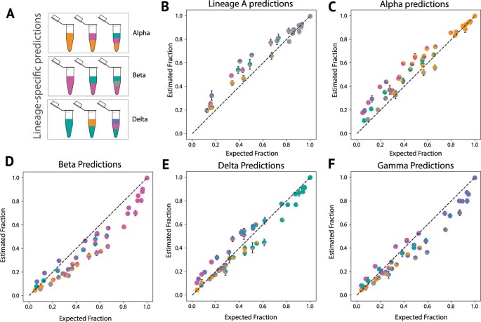
Extended Data Fig. 3. Lineage-specific prediction of variant abundance in spike-in validation samples.
A. Schematic of “spike-in” sample design. B-F. Lineage specific prediction. Proportions of each lineage in the sample are shown as a pie chart marker (Grey = Lineage A, Orange = Alpha, Pink = Beta, Turquoise = Delta, and Purple = Gamma) with error bars indicating the standard deviation from the mean, across four replicates (n = 380, four samples per mixture type).

