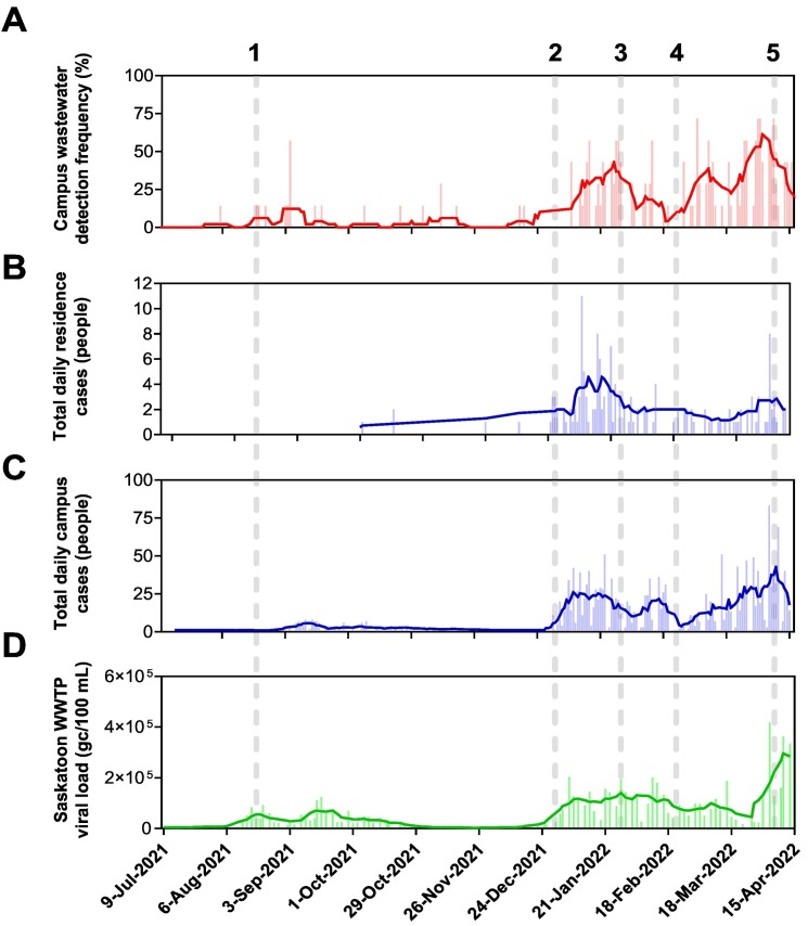
Fig. 3.
Comparison of daily SARS-CoV-2 metrics between university residences, campus, and Saskatoon Wastewater Treatment Plant data. (A) Distribution frequency plot of SARS-CoV-2 detection across the residences including a 7-day moving average of hits (solid red line); (B) distribution frequency plot of total daily cases (people) reported in residences including 7-day moving average of cases (solid blue line); (C) total reported daily cases for the entire university campus including 7-day moving average of cases (solid blue line); and (D) daily viral load as measured and reported by Saskatoon WWTP including 7-day moving average of load (solid green line). The numbered dashed lines (1–6) represent specific events that will be discussed in the main manuscript.

