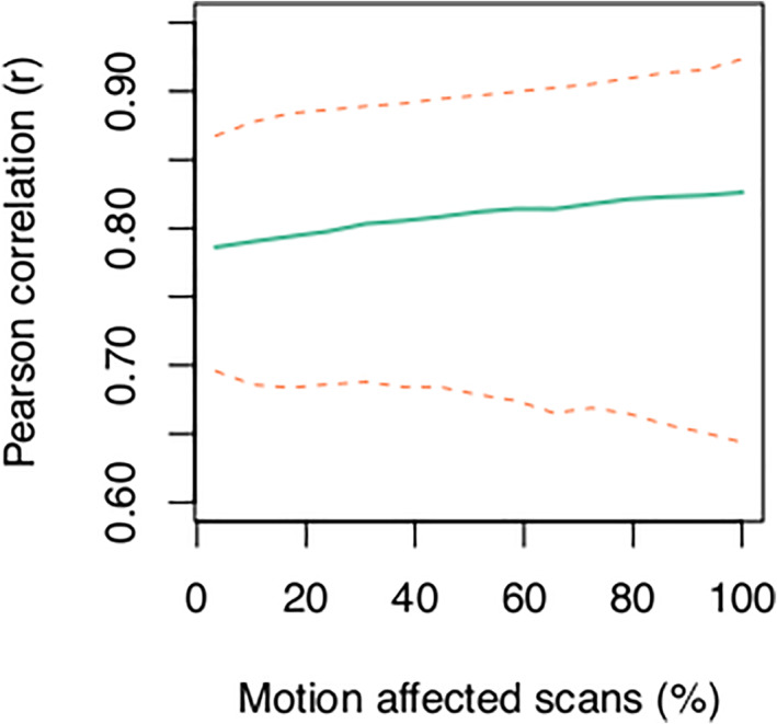
FIGURE 7.

The correlation between gray matter volume estimates increases as the number of motion‐affected scans included in a dataset increases. The green line shows the average Pearson r across all brain regions and the dashed lines indicate the 2.5th (lower line) and 97.5th (upper line) percentiles for N = 5000 iterations for each setting of the number of motion‐affected scans
