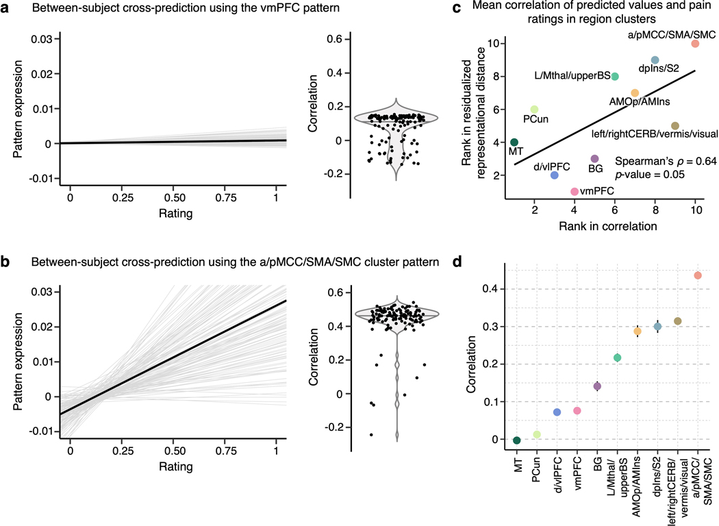
Extended Data Fig. 9. Cross-individual pain prediction.
To further illustrate the inter-individual variability in pain representations across different region clusters, we conducted cross-individual prediction of pain using pain predictive patterns of region clusters in Study 14. The panels (a) and (b) show examples of the cross-prediction using the vmPFC (the most variable region cluster) and a/pMCC/SMA/SMC (the most stable region cluster) cluster patterns, respectively. The gray lines in the line plots show the mean regression lines of pain prediction in others using an individual’s predictive map (i.e., each line indicates the prediction using one participant’s pain prediction model). The black lines show the global average of all the individual regression lines. The violin plots show the mean correlation between the predicted and actual pain ratings in cross-individual pain prediction. Each dot represents mean prediction-outcome correlation using one participant’s pain prediction model. (c) We calculated the global cross-individual prediction performance of each region cluster using prediction-outcome correlations. The top panel shows the relationship between the rank in the mean residualized distance (y-axis), where clusters are ordered from the most variable to the least variable cluster, and the rank in the correlation values (x-axis), where the clusters are ordered from the lowest to the highest cross-individual prediction performance. Together with the examples in (a) and (b), this plot suggests that the cross-individual prediction is more reliable in the clusters with lower inter-individual variability. (d) The plot displays the mean correlation values with the standard error of the mean for each region cluster based on n = 124.

