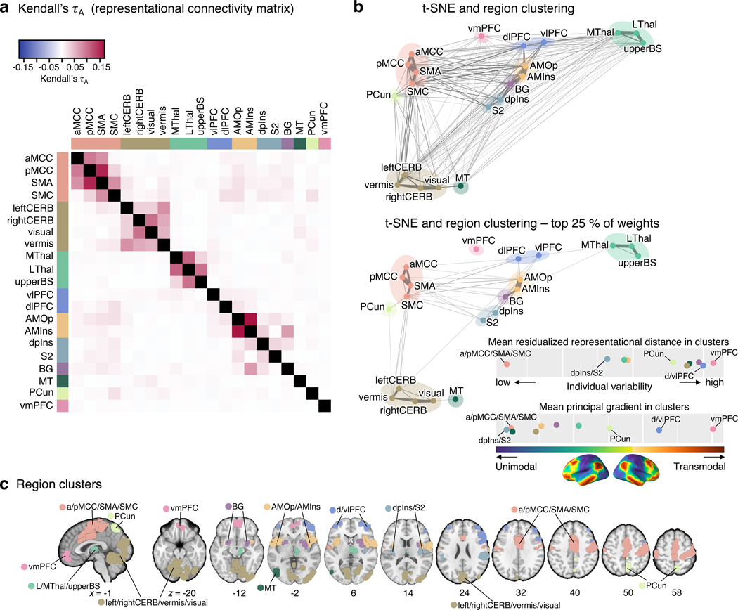
Figure 5. Clustering of the pain-predictive brain regions based on the patterns of representational distance.
(a) The heat map shows the representational connectivity matrix (Kendall’s τA) among 21 pain-predictive regions. Higher Kendall’s τA values (shown in darker red) indicate higher similarity between regions. (b) We conducted a hierarchical clustering analysis of brain regions using the 10-dimensional NMDS scores based on the representational connectivity matrix, resulting in 10 region clusters. The plot shows the t-distributed stochastic neighborhood embedding (t-SNE) map based on the 10-dimensional NMDS scores, and the 10 region clusters are shown with different colors. The line widths indicate the relative connectivity strengths among the brain regions. The top panel shows all the connections, while the bottom panel shows only the top 25 % of the connections. The upper bottom right chart displays the mean residualized representational distance of the region clusters (color-coded). Furthermore, in the region clusters we calculated the mean principal gradient that ranges from unimodal to higher-order transmodal areas as suggested by ref.24. The lower chart, then, shows the mean principal gradient in the region clusters suggesting that more variable clusters are located at the top of the principal gradient spectrum, while more stable clusters are located at the bottom of the principal gradient. The bottom cortex map visualizes the principal gradient map obtained from an independent dataset (N = 59). (c) The region clusters are visualized on a brain underlay.

