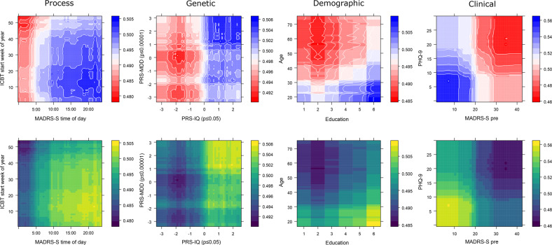
Fig. 4. Partial prediction plots of the strongest two predictors by predictor type.
Each column represents one of the four predictor types from which the two top numeric predictors have been plotted on their respective x and y axis. Colour represents the individual variable contribution to the predicted probability of remission in two ways. The upper panel row is colour-blindness friendly (Blue = higher probability of remission) and the bottom row is greyscale compatible (Light = higher probability of remission). The probability contribution of each variable in each panel is calculated when all other predictors in the model are centred and held constant.

