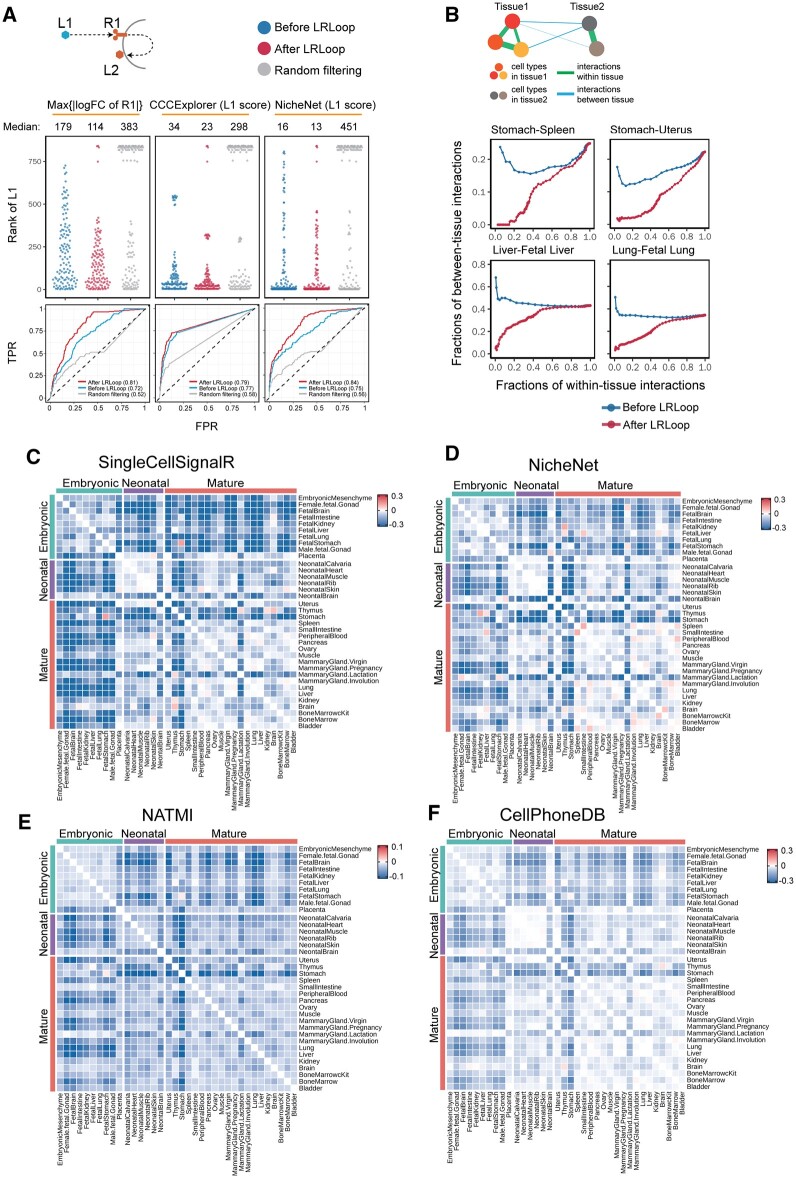
Fig. 3.
Assessment of LRLoop using bulk and single-cell datasets. (A) Assessment using bulk expression datasets. Top panels: each dot represents an expected ligand. Bottom: the corresponding ROCs after applying LRLoop to each method. (B) Assessment using single-cell datasets. We used the between-tissue interactions as the indicator for false positive predictions. In the x-axis are the fractions of within-tissue interactions that remain in all expressed within-tissue interactions. The y-axis displays the fractions of between-tissue interactions in all interactions that remain at the cutoff score values. (C–F) Heatmap showing the reduction of between-tissue interactions, calculated as the ratio of the area under the ‘After LRLoop’ curve to the area under the ‘Before LRLoop’ curve as in B, and then minus one, among 630 tissue pairs. Four scoring methods were used

