Figure 2.
Metabolic pathways along the NAFLD spectrum
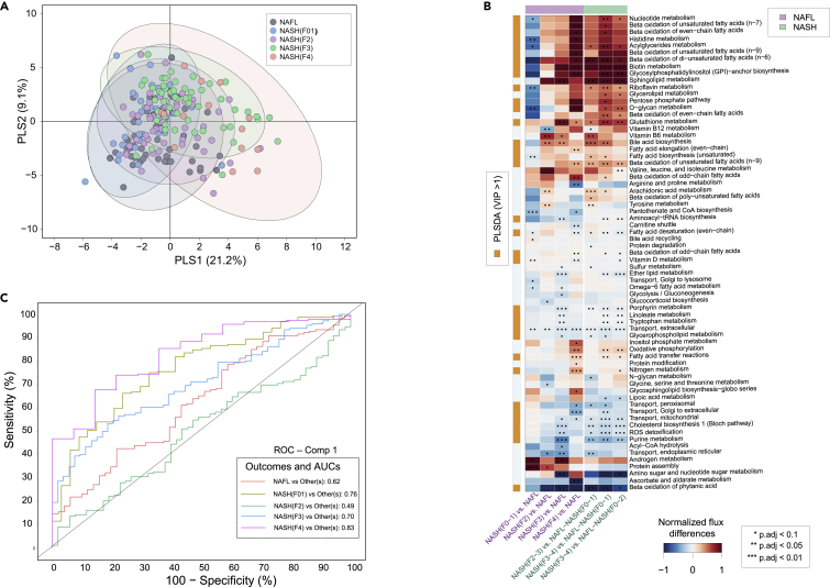
(A) PLS-DA–score plot showing metabolic pathway differences across NAFL and NASH (F0-4) patient groups.
(B) Predicted flux differences across the metabolic subsystems of human hepatocytes at different stages of NAFLD. Red and blue colors denotes up- and downregulated fluxes across the metabolic subsystems within two different stages of NAFLD. ‘∗∗’ and ‘∗∗∗’ denotes statistical signifance (two-sample t-test, p.adj<0.05 and p.adj<0.01 adjusted for FDR) respectively. White color denotes “no change”. Flux state at each stage was estimated by random sampling.
(C) Class-specific AUCs and ROC curves of the PLS-DA model.

