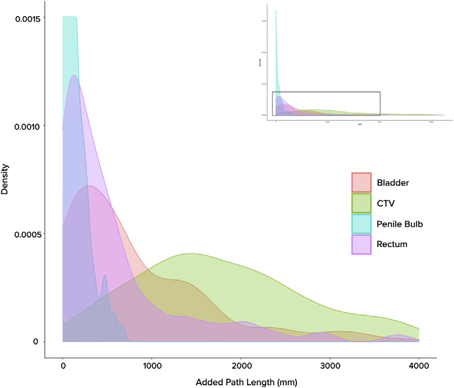
Fig. 1.

Distribution of Added Path Length (APL) across volumes of interest, as represented by kernel density plots. As histogram variants, kernel density plots allow for smoother visualization of data spread across a continuous interval. Full graphical representation of the curves can be seen in the upper right inlay, with the magnified area indicated with the viewfinder.
