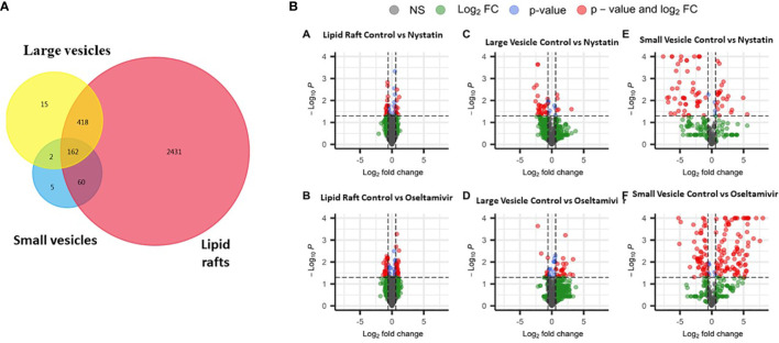
Figure 6.
Proteomic comparison of rafts, LVs and SVs. (A) Venn diagram showing the distribution of proteins in three different components. (B) Volcano plots showing differentially expressed proteins between control and treatments with nystatin (27 μM) and oseltamivir (20 μM). Comparisons are shown in graphs a’ (raft control vs nystatin); b’ (raft control vs oseltamivir); c’ (LVs control vs nystatin), d’ (LVs control vs oseltamivir); e’ (SVs control vs nystatin) and f’ (SVs control vs oseltamivir). Volcano plots show –log10 P-values from the normalized proteomics data exported from Scaffold LFQ vs. log2 foldchange (FC) across each contrast (A–F). Thresholds set were p-value ≤.05 and Log2FC ≤ -1.5 or ≥ 1.5.

