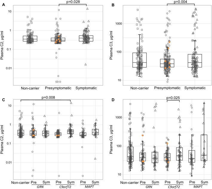
Fig. 3.
Group comparisons of plasma C2 and C3 concentration. A Plasma C2 in clinical groups; B Plasma C3 in clinical groups; C Plasma C2 in genetic subgroups; D Plasma C3 in genetic subgroups. Protein concentrations were plotted on a logarithmic scale for ease of visualisation. Orange circles indicate presymptomatic carriers who developed symptoms during follow-up, one of whom was excluded from C2 analyses due to a duplicate CV > 20%. P-values were derived from quantile regression models with age and sex as covariates. Pre presymptomatic, Sym symptomatic

