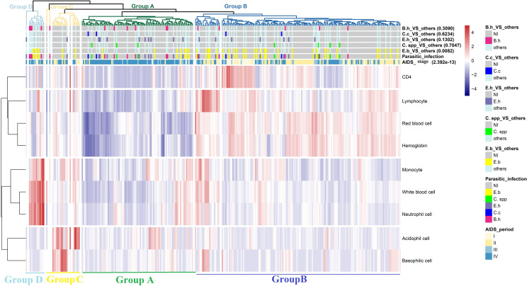
Fig 4. Clustering heatmap of the infection data.
Among the 7 color bars, the bottom two are parasitic infection statuses and AIDS periods, and different colors represent different kinds of parasitic infections or different AIDS stages. The remaining 5 color bars are derived from the parasitic infection variable. For instance, in the group of “E.b._VS_other”, samples with parasitic infection of E.b. make up the group of interest, and parts 2 to 5 are separated into another group, while the uninfected group is comprised of samples with no parasitic infection. The other group and the non-infected group are labeled with cyan and gray colors, respectively. The group of interest is marked with a distinct color corresponding to the color in the parasitic infection status (NI, not infected; E.b., E. bieneusi; C. spp., Cryptosporidium spp.; E.h., E. histolytica; C.c., C. cayetanensis; B.h., B. hominis).

