
Figure 3.
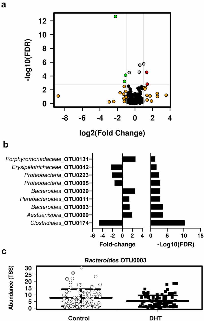
Effect of DHT exposure on the relative abundance of bacterial taxa. (A) Volcano plot of differentially abundant taxa between control and PCOS-like mice identified using DESeq2 analysis against the top 300 OTUs. The light gray horizontal line perpendicular to the y axis shows where P = .05 with points above the line having P < .05. The two light gray line perpendicular to the x axis shows fold-changes of 2 (log2 = 1) and −2 (log2 = −1). Green dots are OTUs with relative abundance significantly greater than two-fold in PCOS-like mice as compared to controls. Red dots are OTUs with relative abundance significantly greater than two-fold in controls as compared to PCOS-like mice. Grey dots are OTUs with relative abundance less than −2 or 2-fold significant difference between control and PCOS-like mice. Orange dots represent OTUs with relative abundances greater than two-fold difference between control and PCOS but were not significantly different. Black dots are OTUs with relative abundance less than −2 or 2-fold difference between control and PCOS but were not significantly different. (B) Graphical representation of fold-change values of the nine OTUs identified to have significantly different relative abundance between control and PCOS-like mice following false discovery rate (FDR) correction. (C) Scatterplots of the most abundant taxa out of the nine OTUs found to be significantly different between control and PCOS-like mice. Data are displayed as mean ± SEM (n = 93–94 mice/treatment group) .