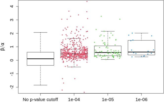
Fig. 1. Distributions of the prognostic to predictive effect size ratios calculated from the IMPROVE-IT PGx GWAS summary statistics data with n = 5661 unrelated European samples.

The left boxplot shows the distribution of whole genome SNPs (after clumping, m = 8,551,930). The right three boxplots show the distribution of top SNPs (after clumping) with their 2df (G + G × T) two-sided test p-values less than the three p-value thresholds 1e−06 (m = 16), 1e−05 (m = 81), and 1e−04 (m = 472), respectively. In each boxplot, the band indicates the median, the box indicates the first and third quartiles, and the whiskers indicate ± 1.5 × interquartile range. Effect size ratios of m SNPs are overlaid on the corresponding boxplot as dot points.
