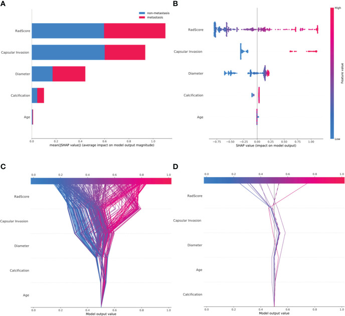
Figure 5.
SHAP plots of the XGBoost model. (A) The classified bar charts of the SHAP summary plots show the influence of each parameter on the XGBoost model. (B) The SHAP summary plot’s scatter plot shows the relationship between the characteristic value and the predicted probability through colors, including positive and negative predictive effects. (C) SHAP decision plot for all patients with PTC; (D) SHAP decision plot for 10 random patients with PTC, with one misjudgment case (dotted line).

