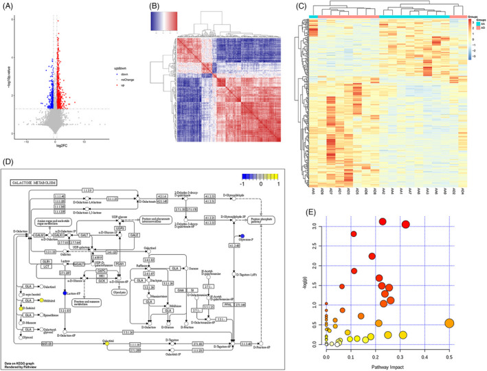
FIGURE 2.

Different metabolites correlations between the AA and AD groups. (A) Volcano map illustrating the different metabolites between the AA and AD groups. (B) Heat map chart of the correlation of different metabolites between the AA and AD groups. (C) Heat map chart of the comparison group. (D) Pathway analysis of the differential metabolites. (E) Bubble chart of the enrichment of metabolic pathways of different metabolites
