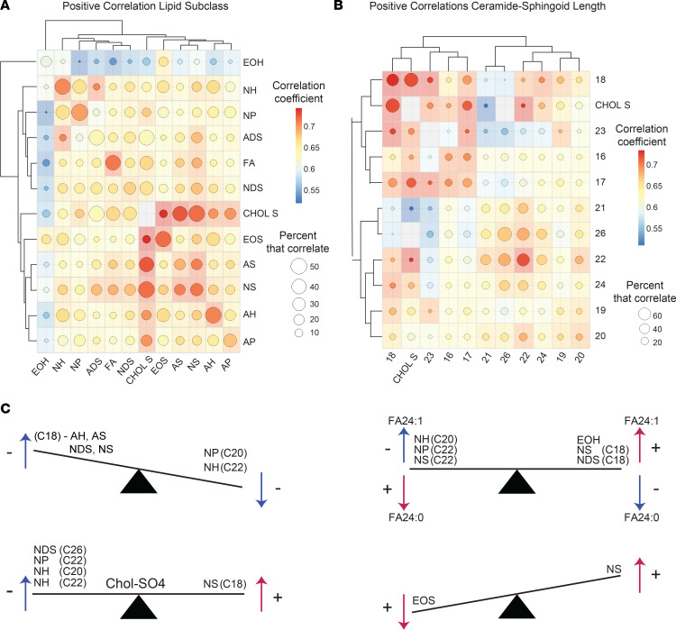
Figure 12. Lipid expression patterns.
(A) Correlation matrix representing the patterns of positive correlations among different lipid subclasses. The intensity of the color at the intersect between a column and row represents the average correlation coefficient for that particular lipid subclass combination. The size of the circle within each colored box represents the percent of lipids that positively correlated. Hierarchical clustering was used to order the lipid subclasses based on the similarities between their patterns of correlation. (B) Ceramides were grouped by the length of their sphingoid bases. Lipid expression across different groups was then assessed, and a correlation matrix was constructed. The intensity of color at the intersect between a column and row represents the average positive correlation coefficient for that particular group comparison. The size of the circle within each colored box represents the percent of lipids that correlated. (C) Schematic seesaw diagrams depicting common patterns of lipid-lipid correlations.

