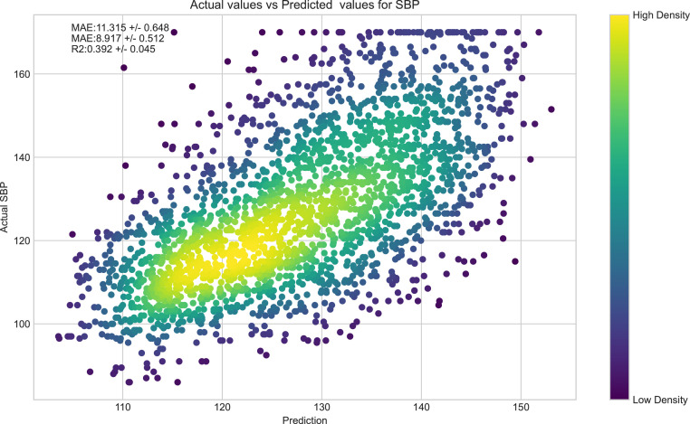
Figure 4.
Scatter plot of SBP within our sample and predicted SBP of the XGBoost algorithm. Actual SBP of each subject within our sample plot along the y-axis and predicted SBP from our model across the x-axis (in mmHg). The colour gradient of each point denotes the density of participants within a particular region of the plot.

