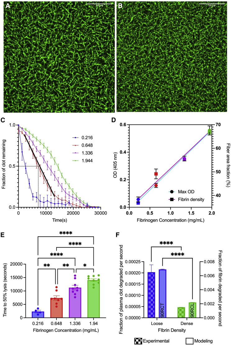
Figure 6.
Model verification using experiments to study the role of densification. Confocal microscopy images showing loose (A) and tight (B) fibrin networks. Maximum OD and fiber area fraction were used to verify densification with varying fibrinogen concentrations. (C) Normalized lysis curves of the different fibrinogen concentrations after the delivery of t-PA and initiation of lysis, with black dotted lines showing time at 50% lysis (in seconds), and a representative linear fit for degradation rate analysis (in terms of fraction of clot remaining per second) (D). Time at 50% lysis (E) and degradation rate (F) are used to assess clot lysis. A side-by-side comparison of experiments (0.22 versus 1.94 mg/mL) and modeling (90RCL versus 90RCT) of loose and dense clot degradation rates (F). Data represented as mean ± SEM. ∗p < 0.05, ∗∗p < 0.01, ∗∗∗p < 0.001, ∗∗∗∗p < 0.0001. For all figures, blue, red, purple, and green represent 0.22, 0.65, 1.34, and 1.94 mg/mL, respectively. To see this figure in color, go online.

