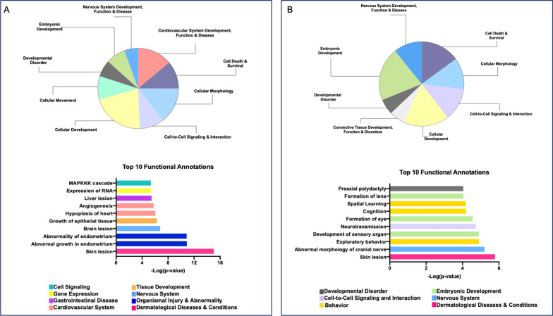
Fig. 2.
Top IPA disease and functions. (A-top) Pie chart of disease and function categories that have 10 or more associated terms from the LE dataset. (A-bottom) graph of the top ten most significant disease or function annotations from the LE dataset. (B-top) Pie chart of disease and function categories that have 10 or more associated terms from the EE dataset. (B-bottom) Graph of the top ten most significant disease or function annotations from the EE dataset. For both A and B bottom graphs, the Y-axis represents the annotation, and the x-axis is the -log of the p-value. The colors correspond to the category to which this disease or function was annotated (represented by the color legend on the bottom)

