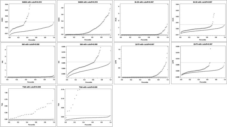
FIG. 2.
Scatter plots of antibody levels versus their corresponding percentiles. Scatter plots were constructed by plotting the antibody levels on the y axis and the corresponding percentiles on the x axis by their IAbs or TGA case status. A horizontal line on the graph corresponded to at least 99th percentile in the control group. The mark “o” represents for the cases and “+” for the controls. Two plots were presented for each antibody, right panel with whole y axis range and left panel with amplified low range of y axis. IAbs, islet autoantibodies.

