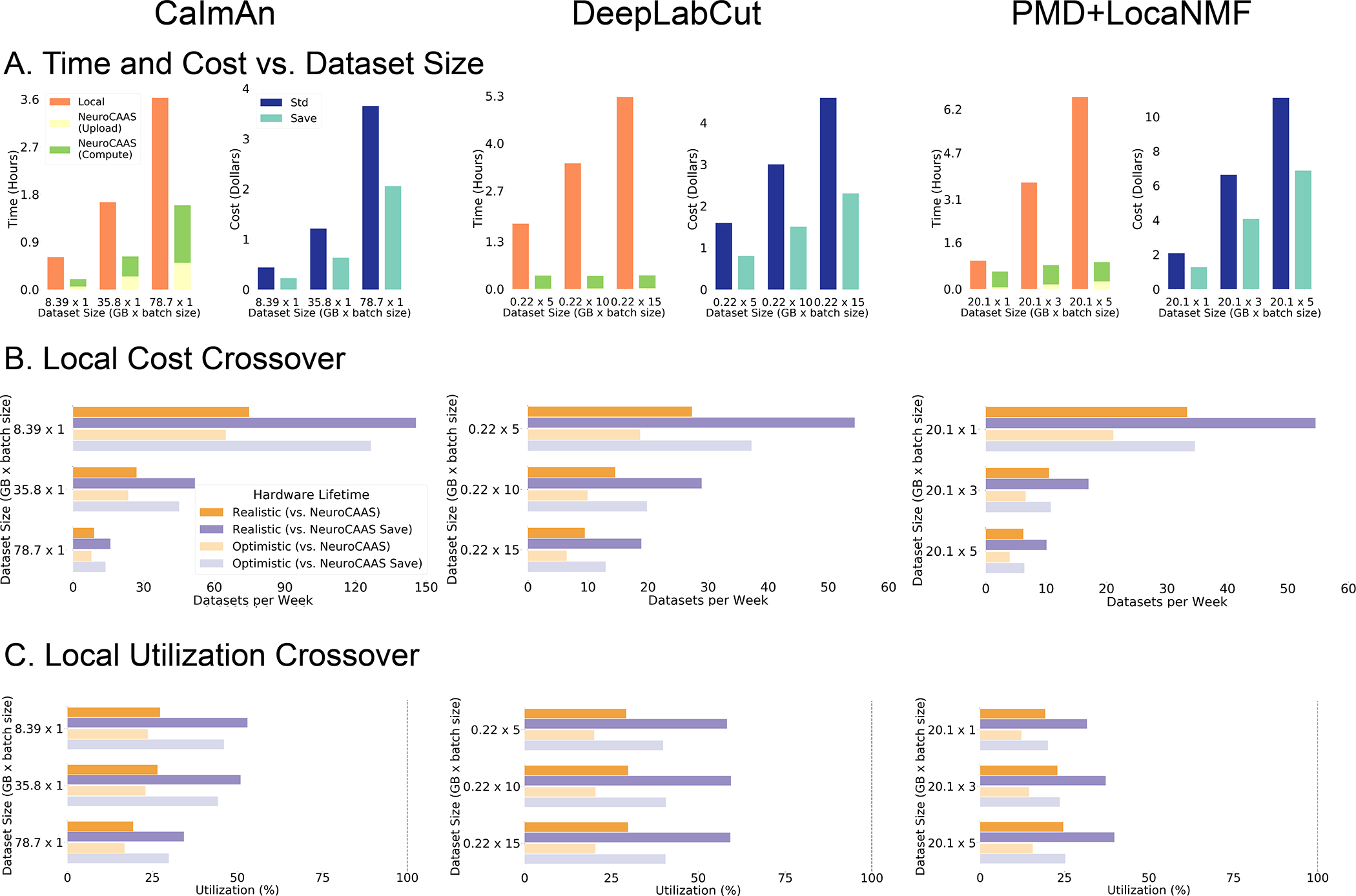
Figure 7: Quantitative Comparison of NeuroCAAS vs. Local Processing for Three Different Analyses.

A. Simple quantifications of NeuroCAAS performance. Left graphs compare total processing time on NeuroCAAS vs. local infrastructure (orange). NeuroCAAS processing time is broken into two parts: Upload (yellow) and Compute (green). Right graphs quantify cost of analyzing data on NeuroCAAS with two different pricing schemes: Standard (dark blue) or Save (light blue). B. Cost comparison with local infrastructure (LCC). Figure compares local pricing against both Standard and Save prices, with Realistic (2 year) and Optimistic (4 year) lifecycle times for local hardware. C. Achieving Crossover Analysis Rates. Local Utilization Crossover gives the minimum utilization required to achieve crossover rates shown in B. Dashed vertical line indicates maximum feasible utilization rate at 100% (utilizing local infrastructure 24 hours, every day). See Figure S7 for cluster analysis, and Tables S4–S8 for supporting data.
