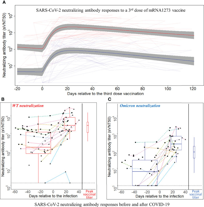
Figure 2.
SARS-CoV-2 neutralizing antibody responses to a third dose of mRNA1273 vaccine or COVID-19 infection. (A) SARS-CoV-2 neutralizing antibody responses to a third dose of mRNA1273 vaccine. Day 0 is the third dose administration date. The Y-axis is plotted on a log10 scale. Thin light red and light blue lines connect individual patient-level sVNT50 against wild type (WT) and Omicron, respectively. The heavy lines are estimates of population mean trajectories gleaned from the semiparametric mixed-effects model for sVNT50-WT (red) and sVNT50-Omicron (blue) time series data, respectively. The gray area represents the 95% confidence intervals. (B, C) SARS-CoV-2 neutralizing antibody responses before and after COVID-19. Panel (B) shows the sVNT50-WT, and panel C shows the sVNT50-Omicron. Day 0 is the date of COVID-19 diagnosis. The Y-axis is plotted on a log10 scale. For the time series depiction, each patient contributed between one and 11 samples in a time interval from 60 days pre- to 40 days after COVID-19 diagnosis. The gray dotted line indicates the assay detection limits. Measurements from the same patient are connected by a straight line. Each color indicates an individual patient. Solid lines with triangle dots indicate patients without a third vaccine dose. Dashed lines with square dots indicate patients who received a third vaccine dose. The box-and-whisker plots build on titers closest before COVID-19 diagnosis and latest in the first post-diagnosis month. For comparison, the peak titers after the third vaccine dose (red for sVNT50-WT, blue for sVNT50-Omicron) are drawn at the right side of each panel as box-and-whisker plots.

