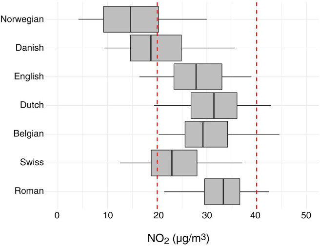
Figure 13.
Description of NO2 exposure at participant addresses in administrative cohorts. The boundary of the box closest to zero indicates P25, the boundary furthest from zero indicates P75, the bold line in the middle of the box indicates P50, and the whiskers indicate P5 and P95. Red dotted lines indicate the WHO air quality guideline (40 μg/m3) and the WHO Health Risks of Air Pollution in Europe health impact quantification threshold (20 μg/m3) — all annual averages. P = percentile. (Adapted from Stafoggia et al. [In review])

