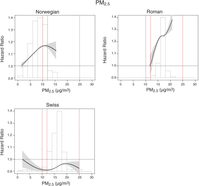
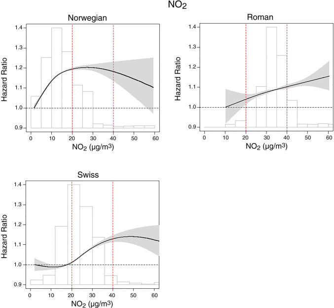
Figure 15.
Natural spline (three degrees of freedom) of the association between natural-cause mortality and PM2.5 and NO2 in seven administrative cohorts. Red dotted lines are air quality limit and guideline values. Hazard ratios expressed relative to minimum exposure. Histograms are of exposure distributions. (Adapted from Klompmaker et al 2021 [Creative Commons license CC BY-NC-ND 4.0] and Staffoggia et al. [In review])


