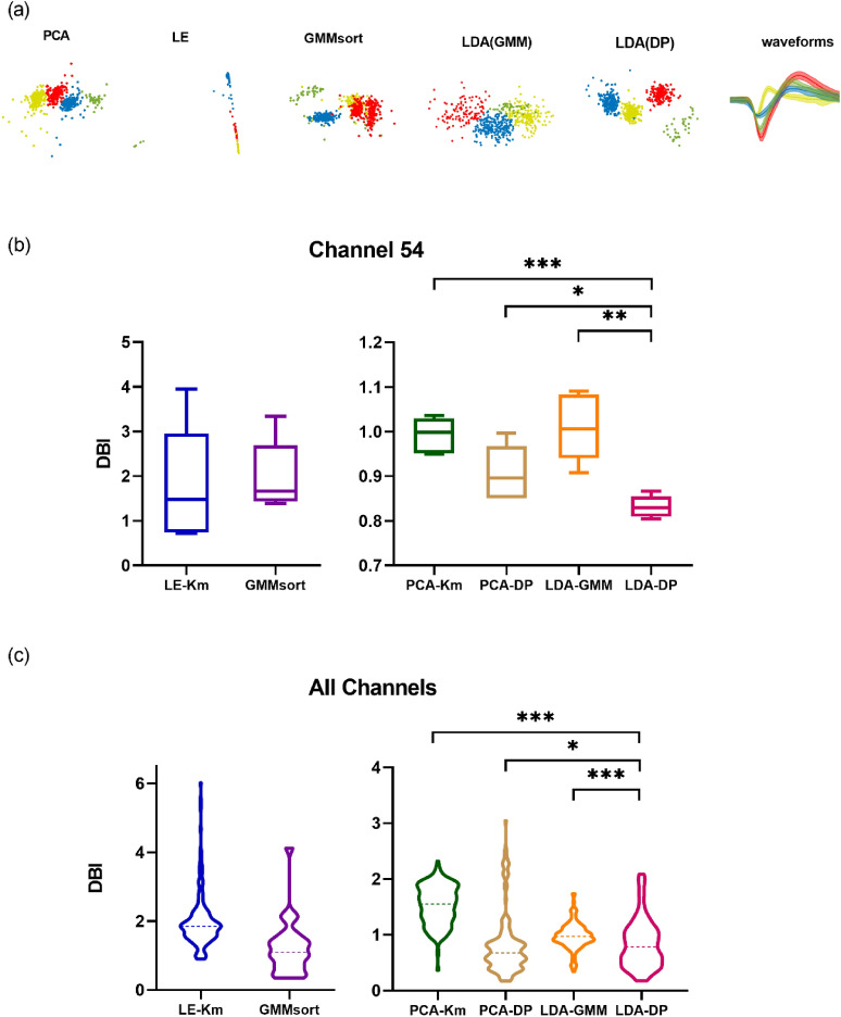
Figure 7.
The sorting results on Dataset C when comparing 6 spike sorting algorithms. (a) Two-dimensional feature subspace extracted by each method. The data points are colored according to the sorting results, in which red, green, yellow and blue represent cluster 1, cluster 2, cluster 3 and cluster 4 respectively. The last column shows the average spike waveforms of four clusters obtained by LDA-DP, and the shaded part represents the standard deviation. (b) Comparison of cluster quality using spikes from one particular channel 54 in Dataset C. We conducted a fivefold cross-validation and draw boxplots of the DBI index for 6 algorithms. *p < 0.05, **p < 0.01, ***p < 0.001, Kruskal–Wallis test. (c) Comparison of cluster quality using spikes from all 30 channels in Dataset C. We conducted a fivefold cross-validation for each channel and then drew the violin plot. The dashed lines represent the median of the DBI. *p < 0.05, ***p < 0.001, Kruskal–Wallis test.

