. 2022 Jul 14;82(18):3275–3290. doi: 10.1158/0008-5472.CAN-22-0363

Figure 3.

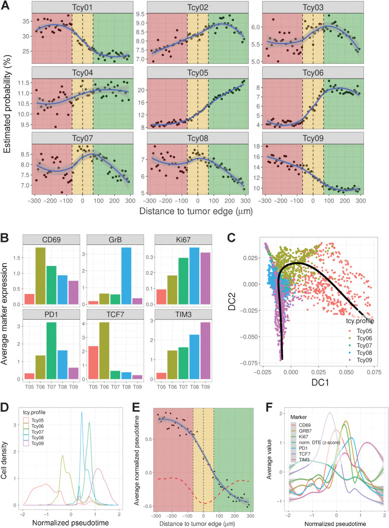
Figure 3. Profiling of Tcys: Lineage. A, Probability gradients around the TSI. Green-shaded area represents the NTA, gold-shaded area represents the TSI, red-shaded area represents the tumor area. Black dots represent the estimated probability of a Tcy in that region to belong to any of the subtypes. The blue curve represents the curve fitting for that cloud of dots. B, Barplots showing the average expression of six preselected markers (CD69, GrB, Ki67, PD-1, TCF7, and TIM3) for a subset of the identified Tcy subtypes (Tcy05:Tcy09). C, Diffusion map representing the projection of the trajectory described by the pseudotime analysis (black line). The scatter plot is colored by the different preselected Tcy subtypes (Tcy05:Tcy09). D, Density plot of the Tcy subtypes within the trajectory defined by the normalized pseudotime. E, Scatter plot showing the correlation between the distance to the tumor edge and the inferred pseudotime trajectory. Black dots represent the average normalized pseudotime for the set of Tcy located at a given distance from the tumor edge. The dashed red line represents the first-order derivative of the fitted curve. F, Histogram plots showing the average expression value of the markers used to define the pseudotime along the trajectory. The normalized distance to the tumor edge (DTE) is also represented.

Profiling of Tcys: lineage. A, Probability gradients around the TSI. Green-shaded area, NTA; gold-shaded area, TSI; red-shaded area, tumor area. Black dots represent the estimated probability of a Tcy in that region to belong to any of the subtypes. The blue curve represents the curve fitting for that cloud of dots. B, Barplots showing the average expression of six preselected markers (CD69, GrB, Ki67, PD-1, TCF7, and TIM3) for a subset of the identified Tcy subtypes (Tcy05:Tcy09). C, Diffusion map representing the projection of the trajectory described by the pseudotime analysis (black line). The scatter plot is colored by the different preselected Tcy subtypes (Tcy05:Tcy09). D, Density plot of the Tcy subtypes within the trajectory defined by the normalized pseudotime. E, Scatter plot showing the correlation between the distance to the tumor edge and the inferred pseudotime trajectory. Black dots represent the average normalized pseudotime for the set of Tcy located at a given distance from the tumor edge. The dashed red line represents the first-order derivative of the fitted curve. F, Histogram plots showing the average expression value of the markers used to define the pseudotime along the trajectory. The normalized distance to the tumor edge (DTE) is also represented.