
Figure 3.
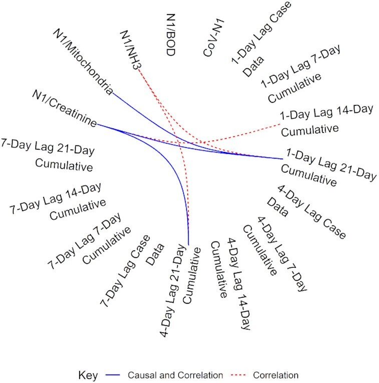
Chord diagram of the correlation and causal relationship between normalized SARS-CoV-2 values and case data. Dashed red lines indicate a positive, significant (P < 0.05) correlation between values. The solid blue lines indicate a similar positive correlation but also a predictive causal relationship between normalized SARS-CoV-2 values and case data (P < 0.10).