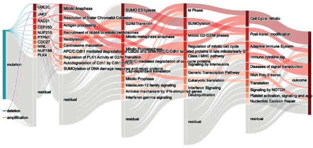
Figure 4.

GCS-Net model pathway Sankey diagram. The Sankey diagram visualization shows the node importance and mutual drive of each layer of the GCS-Net model, and the nodes with darker colors are more important. The left most node represents the input feature data type; the nodes of the second layer represent the last layer of genes constructed according to the Reactome pathway; each subsequent layer represents a higher-level biological pathway; the last layer represents the prediction result.
