Figure 1.
Overview of the Stanford inventions data
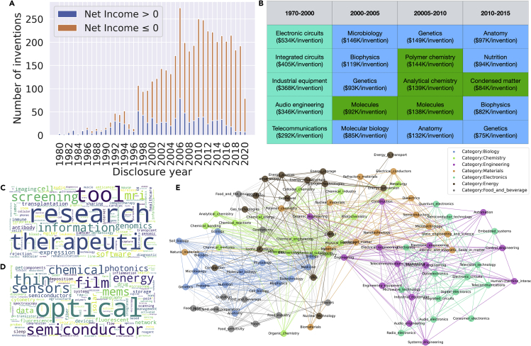
(A) Number of inventions by year that Stanford’s Office of Technology Licensing marketed. The color of the stacked bar chart indicates whether the cumulative net income (until June 31, 2021) is positive.
(B) Categories with the highest average net income across years. The numbers in parentheses indicate the average net income. Cell colors indicate the root category (teal: electronics, blue: biology, green: chemistry).
(C and D) Overrepresented keywords of (C) above-median income inventions (net income above the median for the same year) and (D) below-median income inventions. We identified words with the greatest log likelihood ratio of appearing in above-median invention keywords versus below-income invention keywords. The size of each term in the word cloud corresponds to its log likelihood ratio.
(E) Visualization of the sub-categories and the collaborative relationship among them. Each node represents a sub-category, and the edge is defined as the percentage of overlapping inventions that the two sub-categories share. Node color indicates the root category. Intra-category edges are colored using the color of the root category. Inter-category edges are colored gray.

