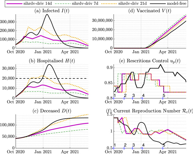
Figure 3.
Time histories of the retrospective analysis: 1 October 2020-1 June 2021. The purple line represents our SIHRD-V model-driven results with a policy update of 14 days (sihrdv-driv 14d). We also include results with a policy update of 7 days (the green dashed line named sihrdv-driv 7d), and of 21 days the (orange dotted line named sihrdv-driv 21d). The black line represents the actual intervention policy followed in the UK. The black dashed line is desired upper limit for the hospitalisation (equal to 20,000). The hospitalised population remains below 20,000 if our intervention strategy is used. The numbers on the horizontal axis in Sub-Figures (e) and (f) represent the instants when adjustments are taken in the model-free setup.

