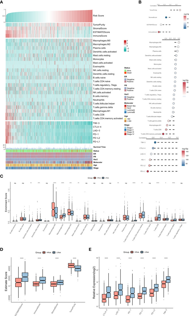
Figure 5.
The immune landscape of the NRG-related risk model (A). Heat map showing the correlations between RiskScore, EstimateScore, the abundance of immune cell infiltration, immune checkpoint expression, and clinical characteristics; (B). from top to bottom: correlation between RiskScore and EstimateScore, between RiskScore and immune cell infiltration abundance, and between RiskScore and immune checkpoint expression; (C). Box plot showing the differences in the abundances of immune cell infiltration between the high-risk and low-risk groups; (D). Box plot showing the differences in EsimateScore between the high-risk and low-risk groups; (E). Box plot showing the differences in immune checkpoint expression between the high-risk and low-risk groups *p < 0.05; **p < 0.01; ***p < 0.001 **** p < 0.0001. ns, p > 0.05.

