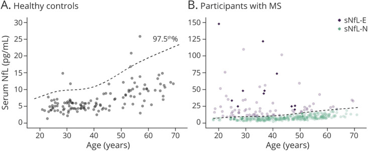
Figure 1. Scatterplot of Serum Neurofilament Light Chain vs Age in the Healthy Controls and MS Participants.
Scatterplot of sNfL by age in the healthy controls (A) and participants with MS (B). The superimposed dashed line is the age-adjusted 97.5th percentile curve that was estimated from the healthy controls and was used to determine elevated (sNfL-E) vs normal (sNfL-N) levels of sNfL. Data points from participants with recent relapse (within the 2 months preceding blood sampling) are depicted as solid diamonds. MS = multiple sclerosis; sNfL = serum neurofilament light chain.

