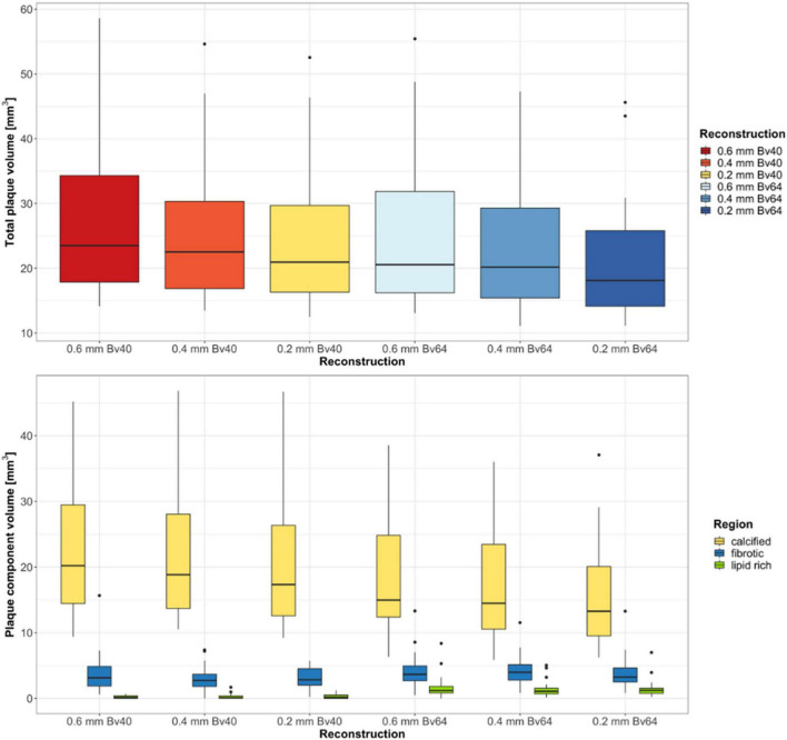
FIGURE 2.
Results of the quantitative plaque analysis. Boxplots at the top show the total plaque volume and boxplots at the bottom depict the volume of the different plaque components determined on reconstructions with three different slice thicknesses and two different kernel strengths. Horizontal lines in the boxes indicate the median, and the top and bottom lines of boxes indicate the first and third quartiles, respectively. Whiskers show lowest and highest values within 1.5 interquartile range of the lower and upper limits, and circles indicate outliers.

