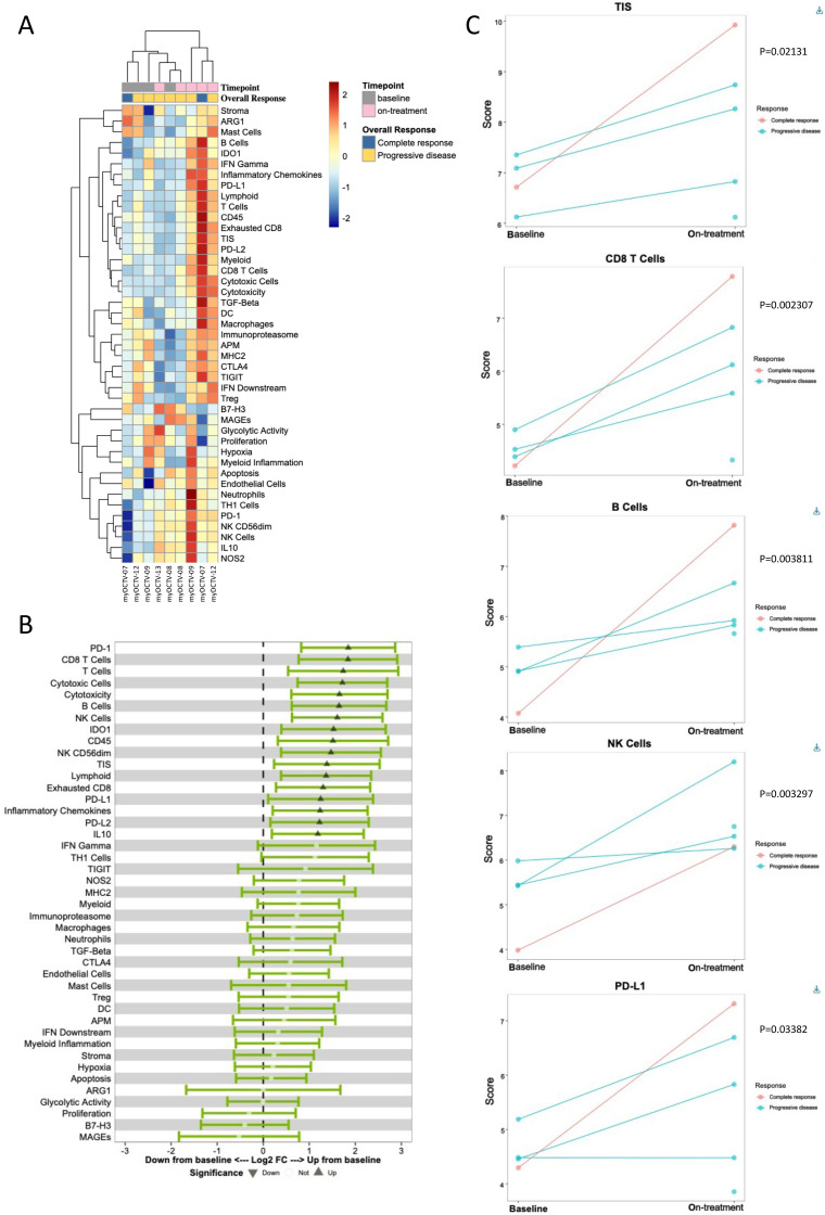
Figure 4.
Gene expression profiling of baseline and on-treatment biopsies. (A) Heat map representing unsupervised hierarchical clustering of signature scores (each vertical line represents the scores for one sample). Scores are scaled by signature to have a mean of zero and a SD of one. The color code indicates the relative value of signature score, and the color key is shown on the right. For four patients, a baseline and an on-treatment biopsy were analyzed, for one patient only an on-treatment sample was analyzed (sample annotations are depicted on top of the heatmap). (B) Forest plot showing the differential expression means and 95% CI between two time points for each level of a secondary grouping variable, for each signature on an unadjusted scale. Triangles show significantly upregulated signatures while open circles indicate non-significantly changed signatures. (C) Time series of baseline and on-treatment biopsies. Spaghetti plots displaying individual sample scores for a single signature (CD8+ T cells, B cells, NK cells, TIS, PD-L1). NK, natural killer.

