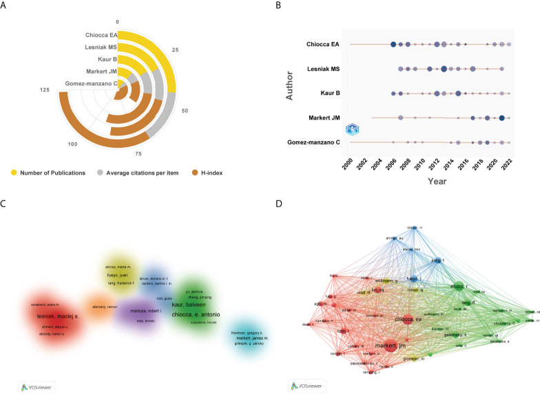
Figure 7.
(A) The top 5 authors published the highest number of studies in this domain. (B) The top 5 authors’ production over time. The circle size represented the number of publications, and the larger the circle, the greater the number of documents. The shade of the circle color signified the total number of citations that the author acquired in this year. The darker the color, the greater the citation times. (C) Cluster visualization map of author cooperation analysis. Nodes with close cooperative relationships allocated to the same cluster with the same color. (D) Network visualization map of co-cited authors generated by VOSviewer. The meaning of colored lines and nodes was similar to Figure 3A .

