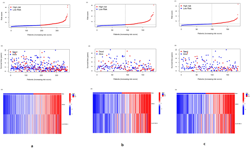
Figure 5.
The risk curve of the three groups. In Figures 5a, (1) and (2) are the same in abscissa. They are the samples arranged according to the risk score from small to large, and the ordinate is the risk score of the samples. The patient risk score increases from left to right, with the median risk score dividing patients into high-risk (red) and low-risk (blue) groups. (2) The far point in red represents the death of the patient, the blue represents the survival of the patient, and the ordinate represents the survival time of the patient. As the patient's risk score increases, the number of patients who died increases. (3) Red represents the high expression of lncRNA, and blue represents low expression. In the high-risk group, both NRAV and AL031985.3 were highly expressed. The same trend as Figure 5a can be seen in Figure 5b and Figure 5c. As the risk score increased, the number of deaths increased, and NRAV and AL031985.3 were highly expressed in the high-risk group.

