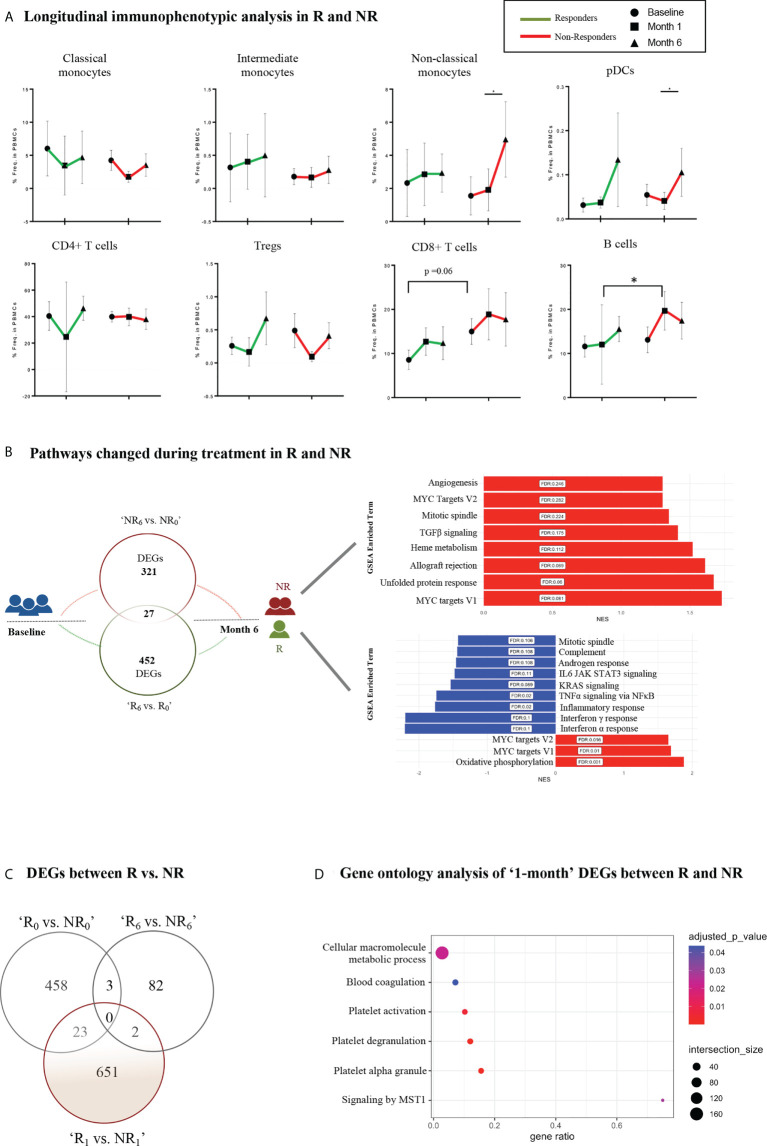
Figure 4.
Longitudinal immunophenotypic and transcriptomic analysis in Responders and Non-Responders. (A) Frequencies of immune cell populations in R and NR (myeloid subsets–up, lymphoid subsets–down) at baseline (0-), 1- and 6-month time points. Results are demonstrated as mean with SD. Statistical significance was obtained by two-way ANOVA test. (B) Schematic diagram of the molecular changes over the course of the follow-up period. Venn diagram (left) represents the DEGs between baseline (0-) and 6-month in R and NR, respectively. The bar plots (right) show the corresponding changes in molecular pathways in NR (up) and R (down). (C) Venn diagram representing DEGs between R vs. NR at baseline (0-), 1- and 6-month after treatment initiation. (D) Dot plot representing pathway analysis of DEGs from R vs. NR at 1-month time point after treatment initiation based on g:Profiler database. R, Responders; NR, Non-Responders; DEGs, Differentially expressed genes. *p ≤ 0.05.

