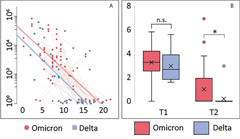
Figure 1.

Viral load. (A) Correlation between viral load and days after symptom onset during the observation period. Thin blue/red lines represent paired samples while thick blue/red lines represent regression curves for the whole group (Omicron or Delta). (B) Viral load shown as Tukey-plots at inclusion (T1) and one week follow-up (T2) according to infection with Omicron or Delta. Differences in viral load at T1 and T2 were compared by ANCOVA, adjusting for symptom days: *p<0.05. ns, not significant.
