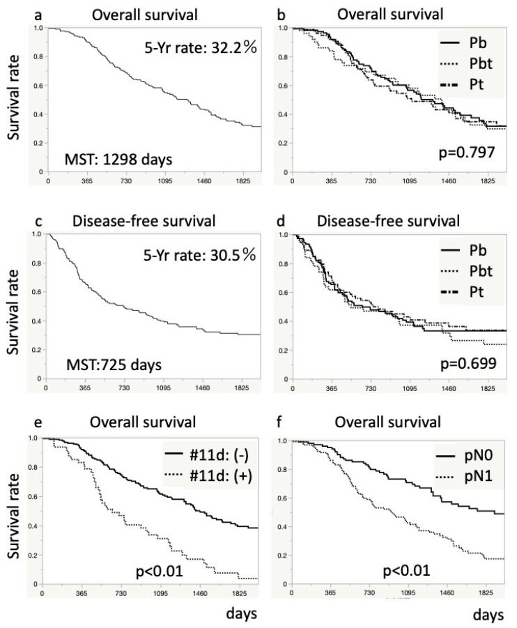
Figure 2.
Kaplan–Meier survival curves for patients after distal pancreatectomy. The upper graphs (a,b) show overall survival rate, and the middle graphs (c,d) show disease-free survival rate. The graphs (a,c) present survival rate for all patients. The graphs (b,d) show a comparison in survival rates based on the tumor site. The lower graphs (e,f) show an overall comparison of survival rates based on lymph node metastasis: (e), pathological node category; and (f), #11d lymph node metastasis. Differences in survival were analyzed using log-rank tests.

