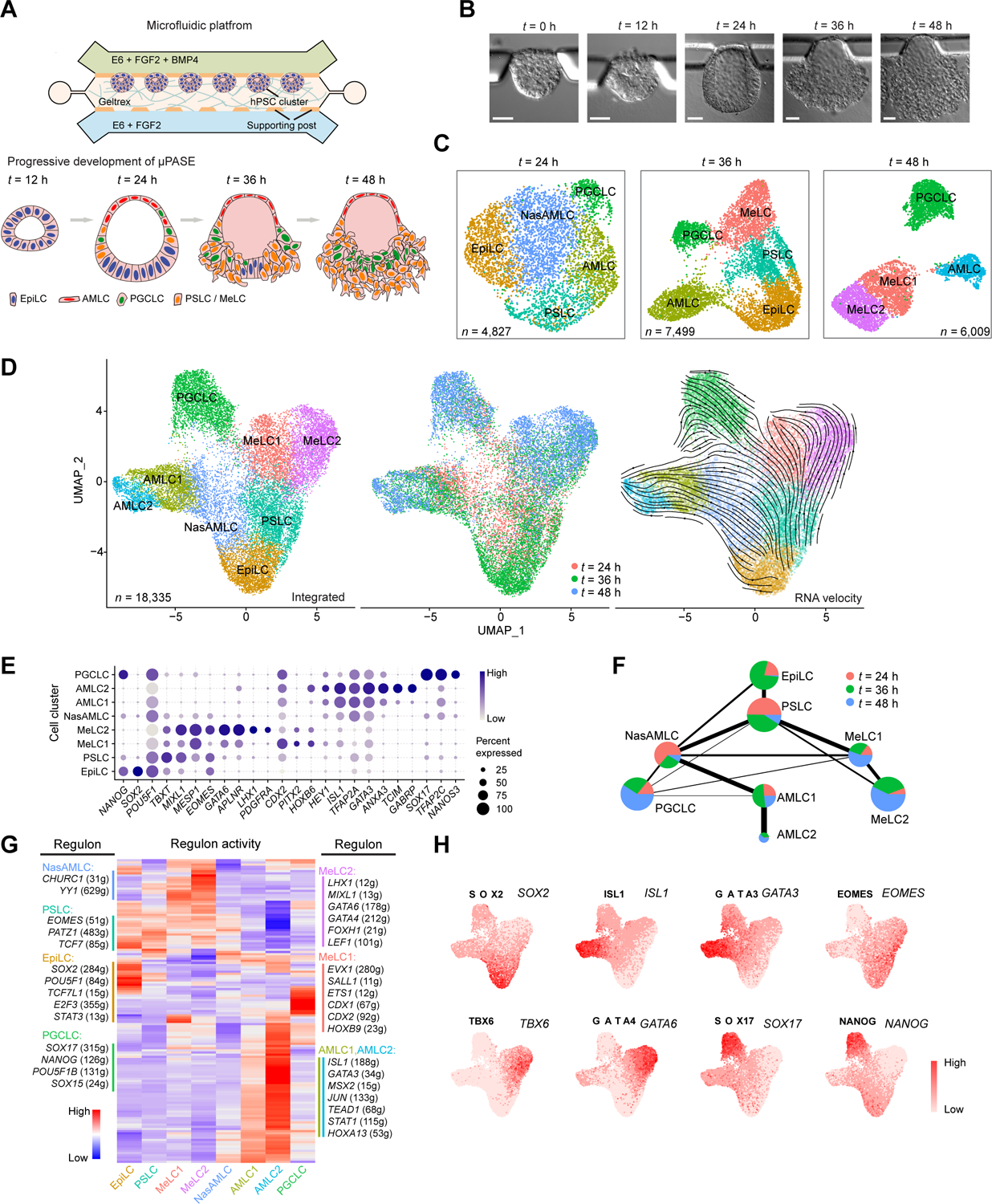
Figure 1. Single-cell transcriptomic profiling of μPASE development.

(A) Development of μPASEs. Single hPSCs were guided to form uniform-sized clusters at prescribed locations in the microfluidic device. Asymmetric stimulation with exogeneous BMP4 from t = 0 – 48 h led to progressive development of μPASEs. E6: Essential 6. See Methods for the μPASE protocol.
(B) Bright-field images showing progressive development of μPASEs over time, including thinning and flattening of the incipient amniotic ectoderm and thickening of the incipient mesoderm cells before their dissemination from the μPASE structure.
(C) Dimension reduction presentation via UMAP and cell identity annotations of single-cell transcriptome datasets obtained for μPASEs at indicated time points. n indicates cell numbers analyzed for each time point.
(D) UMAP of integrated single-cell transcriptome datasets of μPASEs from t = 24, 36 and 48 h (shown in (C)), color-coded according to cell identity annotations (left) or time points (middle). RNA velocity vectors were projected onto the UMAP-based embeddings (right). n indicates the total number of cells combined from the three time points.
(E) Dot plot showing expression of key marker genes across the cell clusters as indicated. The sizes and colors of dots indicate the proportion of cells expressing the corresponding genes and their averaged scaled values of log-transformed expression, respectively.
(F) Partition-based graph abstraction (PAGA) analysis of the integrated single-cell transcriptome dataset shown in (D). The thickness of lines connecting pairs of cell clusters indicates the degree of correlation between the cell cluster pairs. Lines with a correlation weight less than 0.05 are not shown. Pie charts for each cell cluster show percentages of indicated cell types from the three time points. Pie chart size is proportional to the total number of indicated cell types. See Mendeley Data Table1.
(G) Heatmap of regulon activities calculated from gene regulatory network interference. Selected master regulators of different cell clusters are depicted as indicated. See Mendeley Data Table2 and HTML Document 1.
(H) Gene set activity of selected regulons overlaid on the integrated UMAP plot from (D).
EpiLC: epiblast-like cell; PSLC: primitive streak-like cell; MeLC1/2: mesoderm-like cell 1/2; AMLC1/2: amniotic ectoderm-like cell 1/2; NasAMLC: nascent amniotic ectoderm-like cell; PGCLC: primordial germ cell-like cell. In (B), experiments were repeated more than twenty times with similar results. Scale bars, 50 μm.
