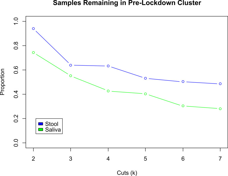
Figure 4.
Comparison of Proportion of Subjects Changing Clusters between Stool and Saliva. These two curves illustrate the change in the proportion of early pandemic samples that remain in the same cluster as their pre-pandemic sample, for stool (blue) and saliva (green) samples. As the hierarchically clustered samples are cut from k = 2 to 7 clusters, the cluster sizes decrease and become more exclusive. Thus, any two samples that are in the same cluster when k = 7 are more similar to each other, than when k was smaller, e.g., 2. Across all cuts k, the early pandemic stool samples tend to be consistently closer to their pre-pandemic mates, than the saliva samples. At k = 2, the proportion of pre- and early pandemic stool samples that in the same cluster are 93.8%, compared to 74.2% in saliva. At k = 7, 48.6% of stool vs. 28.1% of saliva pre- and early pandemic samples are collocated in the same cluster.

