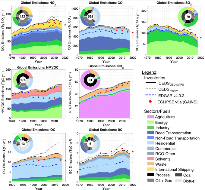
Figure 2.
Time series of global annual emissions of NOx (as NO2), CO, SO2, NMVOCs, NH3, BC, and OC for all sectors and fuel types. Solid black lines are the CEDSGBD-MAPS inventory, with fractional sector contributions indicated by colors. Dashed gray lines are the original CEDSHoesly inventory. Dashed blue lines are the EDGAR v4.3.2 global inventory. Red dots are ECLIPSE v5a baseline “current legislation” emissions with data in 2015 and 2020 from GAINS CLE projections. All inventories include international shipping but exclude aircraft emissions. Pie chart inserts show fractional contributions of emission sectors to total 2017 emissions (outer) and fuel type contributions to each sector (inner). Emission totals for 2017 (units: TgC yr–1 for NMVOCs, OC, and BC) are given inside each pie chart.

