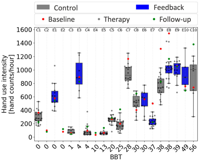
Figure 8.
Relationship between hand use intensity and Box and Block Test (BBT) score. Each circle represents the average hourly count for one day. Participants are ordered by BBT. The box and whisker plots use bars to show the 25% and 75% percentiles of daily hand use intensity, and lines to show these quartiles plus and minus the interquartile range. Thus, the plots indicate the individual distribution of daily hand use intensity across the three weeks of therapy for participants in both groups (control in gray, feedback in blue). Box and whisker plots do not include baseline and follow-up data, which are indicated by red and green dots, respectively. Subject numbers are presented on the top, with Es for participants in the feedback group and Cs for participants in the control group. Note that the x-axis is equally spaced and not scaled to BBT score.

