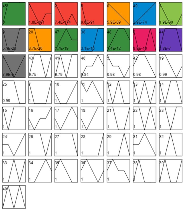
Figure 4.
Time series analysis. Each profile corresponds to a rectangle. The number in the upper left corner of the rectangle is the number of the profile, starting from 0, where the broken line is the trend of the expression amount changing over time, and the value in the lower-left corner is its corresponding significance level p-value. Trend diagram with color: it indicates that the time-series pattern of the profile conforms to the significant change trend. Profiles with the same color belong to the same cluster (profiles with similar trends belong to the same category—the same color). Figure shows that all DEGs can be divided into 50 profiles according to their expression trends, among which 15 categories have significant gene expression trend changes. Additionally, these 15 profiles with significant expression trend changes were further divided into eight clusters because of similar expression trends (consistent color indicates similar expression trends).

