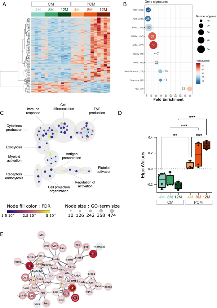
Fig. 3.
Microglial gene expression remodeling in plaque-distant AD microglia. (A) Heatmap of differentially expressed genes in PCM (oranges) versus CM (greens) along aging. The scaled expression value (row Z score) is shown in a blue–red color scheme with red indicating higher expression, and blue lower expression. The full data are available in Additional file 19: Table S7A. (B) Enrichment in DEGs in different gene signatures. The size and the color of each dot are, respectively, proportional to the number of DEGs and the adjusted p-value. The number of DEGs is also indicated in or at proximity of the dot. (C) Cytoscape representation of deregulated GO terms (“Biological Process” category) in PCM versus CM DEGs. The full data are available in Additional file 19: Table S7B. Each dot represents a deregulated GO-Term; their size and color are, respectively, proportional to the number of genes in the GO-term and the enrichment adjusted p-value. GO-Terms are grouped into categories using the Auto-annotate Cytoscape app. (D) Boxplots of eigengene values for each sample in the most abundant WGCNA module of PCM versus CM DEGs (91 genes). Statistical analyses: 2-ways ANOVA with Microglia subtype and Age as between subjects’ factors. Subtype p < 0.001; Subtype:Age p < 0.01. FDR corrected post hoc tests; **p < 0.01, ***p < 0.001. (E) Cytoscape network visualization of highly connected genes in PCM versus CM DEGs. Log2 expression ratio between PCM and CM are mapped to the nodes using a blue–white–red gradient with red indicating higher expression in PCM, and blue lower expression. The inner, middle and outer rings represent log-ratio in, respectively, the 4-, 8- and 12-mo samples. Yellow nodes depict hub genes within the network

