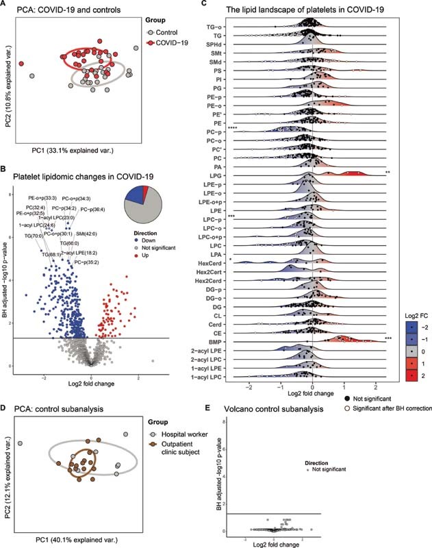
Fig. 1.

The platelet lipidome is altered in patients with COVID-19. ( A ) Principal component analysis (PCA) of the platelet lipidomes, comprising all lipids normalized on specific internal standards per class, of patients with COVID-19 ( n = 25) and matched controls ( n = 23). Each dot represents a subject, the color represents the group. X -axis shows the first principal component and the percentage of explained variance, the Y -axis shows the second principal component and the percentage of explained variance. ( B ) Volcano plot showing the differential abundance of lipids in platelets from patients with COVID-19 and matched controls. Each dot represents a lipid species, while the color indicates whether the lipid is significantly more abundant ( red ), significantly less abundant ( blue ), or not significantly altered ( gray ). The X -axis denotes the log2 fold change between groups, while the Y -axis shows the Benjamini–Hochberg adjusted −log10 p -value. The pie chart represents the whole platelet lipidome and gives an indication of the percentage of lipids that is either more abundant, less abundant, or unchanged. ( C ) Platelet lipid landscape plots, comparing patients with COVID-19 to matched controls. Each dot represents a lipid species, which are grouped per lipid class. The color of the dots indicates whether the lipid was significantly different ( white ) or not ( black ) between the groups after Benjamini–Hochberg correction. The X -axis shows the log2 fold change between groups for each lipid; the color of the ridges indicates up- ( red ) or down-regulated ( blue ) lipids. The Y -axis indicates the different lipid classes, with a ridge plot per lipid class that shows the distribution of the lipids within their respective classes. On the edges of the plot, asterisks denote class-wide significant differences as determined by a Wilcoxon-ranked sum test of aggregated values per class (a sum of all lipids per class per subject). Asterisks on the left of the plot indicate a significant class-wide decrease, and asterisks on the right of the plot indicate a significant class-wide increase. A p -value below 0.05 was considered significant. ( D ) Same as in panel (A), but here showing the control sub-analysis (hospital workers vs. outpatient clinic subject). ( E ) Same as in panel (B), but here showing the control sub-analysis (hospital workers vs. outpatient clinic subject). * p -value < 0.05, ** p -value < 0.01, *** p -value < 0.001, **** p -value < 0.0001. All boxplots of this analysis are shown in Supplementary Fig. S2 .
