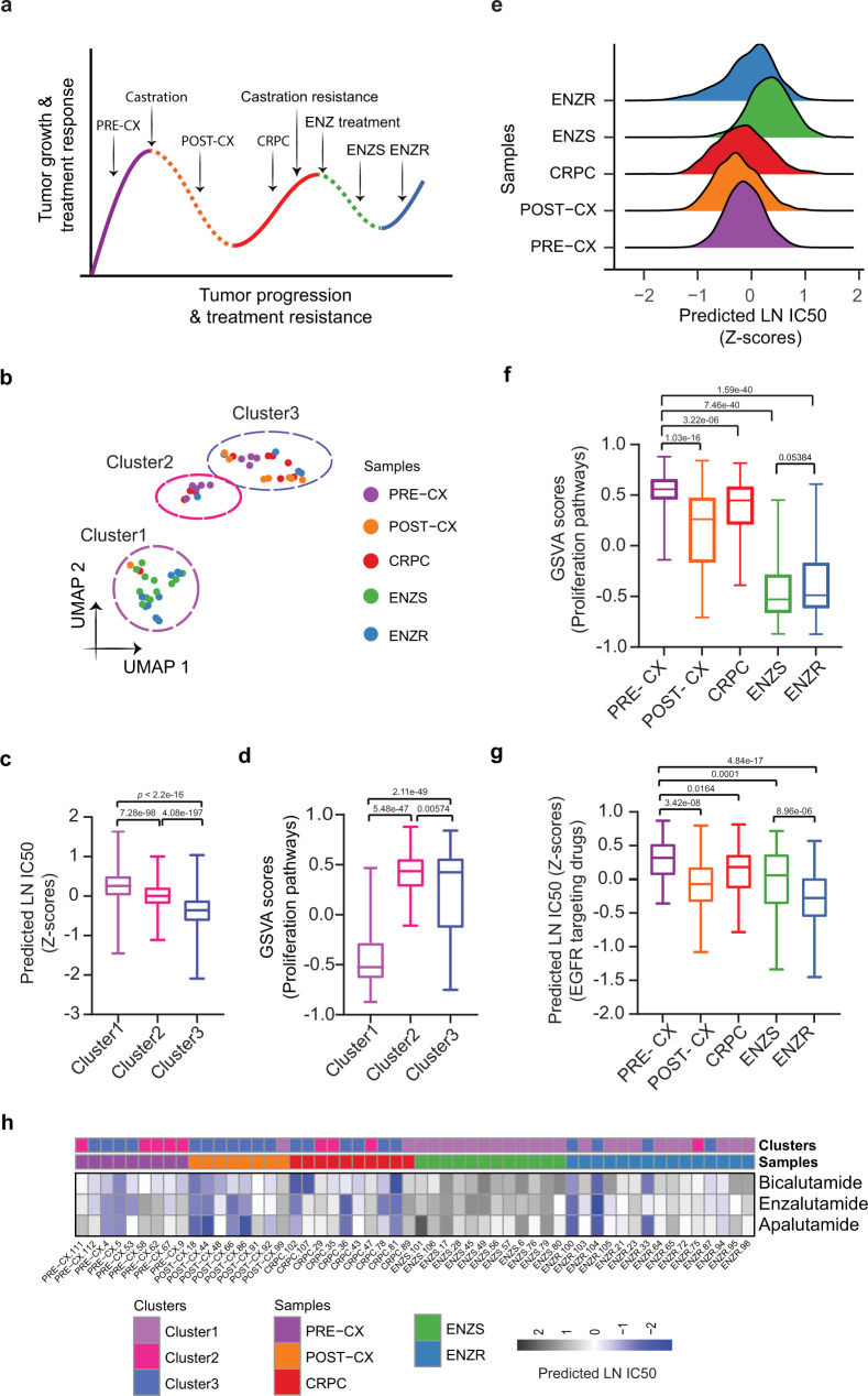
Fig. 4. Analysis of drug response prediction in LNCaP derived xenografts.
a Overall schematics of the experimental setup of LNCaP xenograft-based PCa progression study with indicated treatments, therapeutic response, and therapeutic resistance stages. Solid lines represent growth and treatment resistance; dotted lines represent treatment responsiveness. b Uniform Manifold Approximation and Projection (UMAP) based projections of predicted LN IC50 showing three separate clusters. We subjected predictions to principal component analysis (PCA) and used the first 10 principal components as input for UMAP based embedding. c Boxplots depicting the distribution of predicted LN IC50 (Z-score) across three clusters. Each data point relates to a xenograft tumor sample-drug pair, wherein a sample belongs to one of the clusters as shown in Fig. 4b (n = 24, n = 9 and n = 21 samples from cluster 1, cluster 2 and cluster 3, respectively) and a GDSC drug (n = 155). P-values were obtained from two-sided Wilcoxon rank-sum test. d Boxplots showing the distribution of GSVA scores of proliferation-related pathways (n = 12) across three clusters (n = 24, n = 9 and n = 21 samples from cluster 1, cluster 2 and cluster 3, respectively). P-values were obtained from the two-sided Wilcoxon rank-sum test. e Ridgeplot showing the overall distribution of predicted LN IC50 (Z-score) across tumor types. f Boxplots showing the distribution of GSVA scores of proliferation-related pathways (n = 12) across tumor types (n = 9 PRE-CX, n = 8 POST-CX, n = 10 CRPC, n = 12 ENZS and n = 15 ENZR). P-values were obtained from the two-sided Wilcoxon rank-sum test. g Box plot depicting predicted LN IC50 (Z-score) of EGFR signaling pathway targeting drugs. We examined n = 7 drugs against 54 tumor bulk RNA-seq samples (n = 9 PRE-CX, n = 8 POST-CX, n = 10 CRPC, n = 12 ENZS and n = 15 ENZR), in every possible combination. P-values were obtained from a two-sided Wilcoxon rank-sum test. h Heatmap showing predicted LN IC50 for three unseen drugs not present in GDSC (BIC, APA, and ENZ). Color bars indicate tumor types and clusters as acquired through UMAP projections. In all boxplots (c, d, f, g), the middle horizontal line represents the median value. Each box spans the lower quartile to the upper quartile. The whiskers indicate the minimum and maximum values within 1.5 times the IQR. Source data are provided in the Source Data file.

