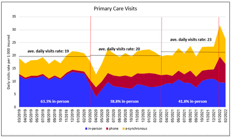
Figure 1.
Primary care visits by type. Y axis: primary care visits per 1000 members. X axis: the calendar month of the visit. Blue area represents in-person visits; red area represents phone visits; and yellow area represents asynchronous communication. The dotted horizontal lines show the average visit rate in each of the three study periods. The first red dotted vertical line indicates the start of the pandemic in Israel (March 2020), the second dotted line indicates the start of the COVID-19 vaccine protective period for the majority of Israelis (March 2021), and the third dotted line indicates the start of the Omicron wave (January 2022).

