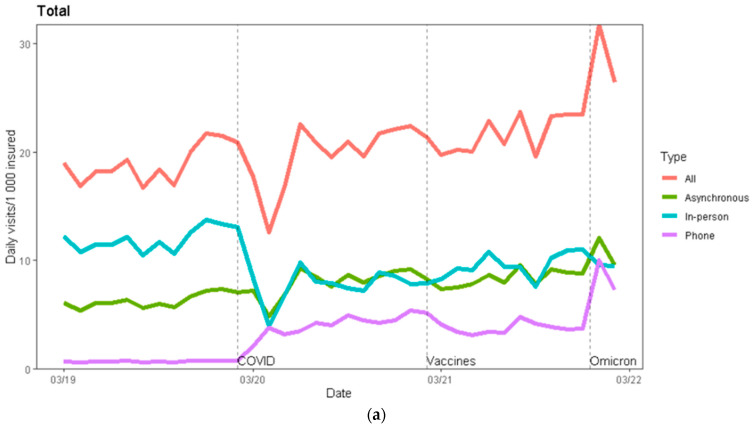
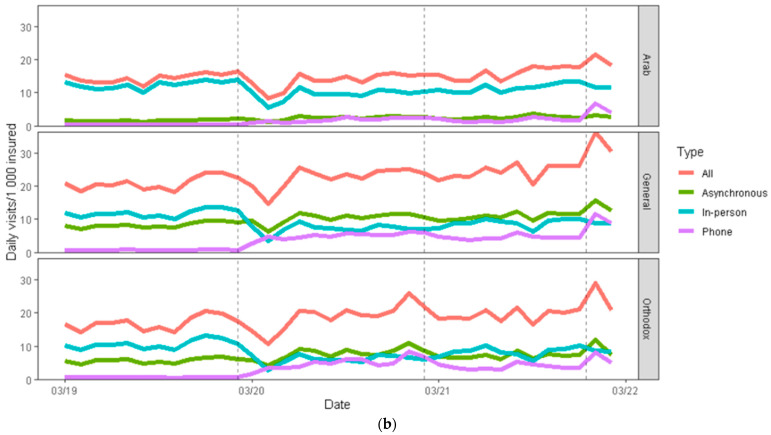
Figure 2.
(a). Total visits by type. Y axis: primary care visits per 1000 members. X axis: the calendar month of the visit. The red line represents overall visits; the green line represents asynchronous communication; the blue line represents in-person visits; and the purple line represents phone visits. The dotted vertical lines and names indicate (from left to right) the start of the COVID-19 pandemic in Israel (March 2020), the start of the COVID-19 vaccine protective period for the majority of Israelis (March 2021), and the start of the Omicron wave (January 2022). (b). In-person, phone, asynchronous and total visits, by sector. Y axis: primary care visits per 1000 members in that sector. X axis: the calendar month of the visit. The red line indicates overall visits; the green line indicates asynchronous communication; the blue line indicates in-person visits; and the purple line indicates phone visits. The dotted vertical lines indicate (from left to right) the start of the COVID-19 pandemic in Israel (March 2020), the start of the COVID-19 vaccine protective period for the majority of Israelis (March 2021), and the start of the Omicron wave (January 2022).


